Three new features and improvements to the website this month!
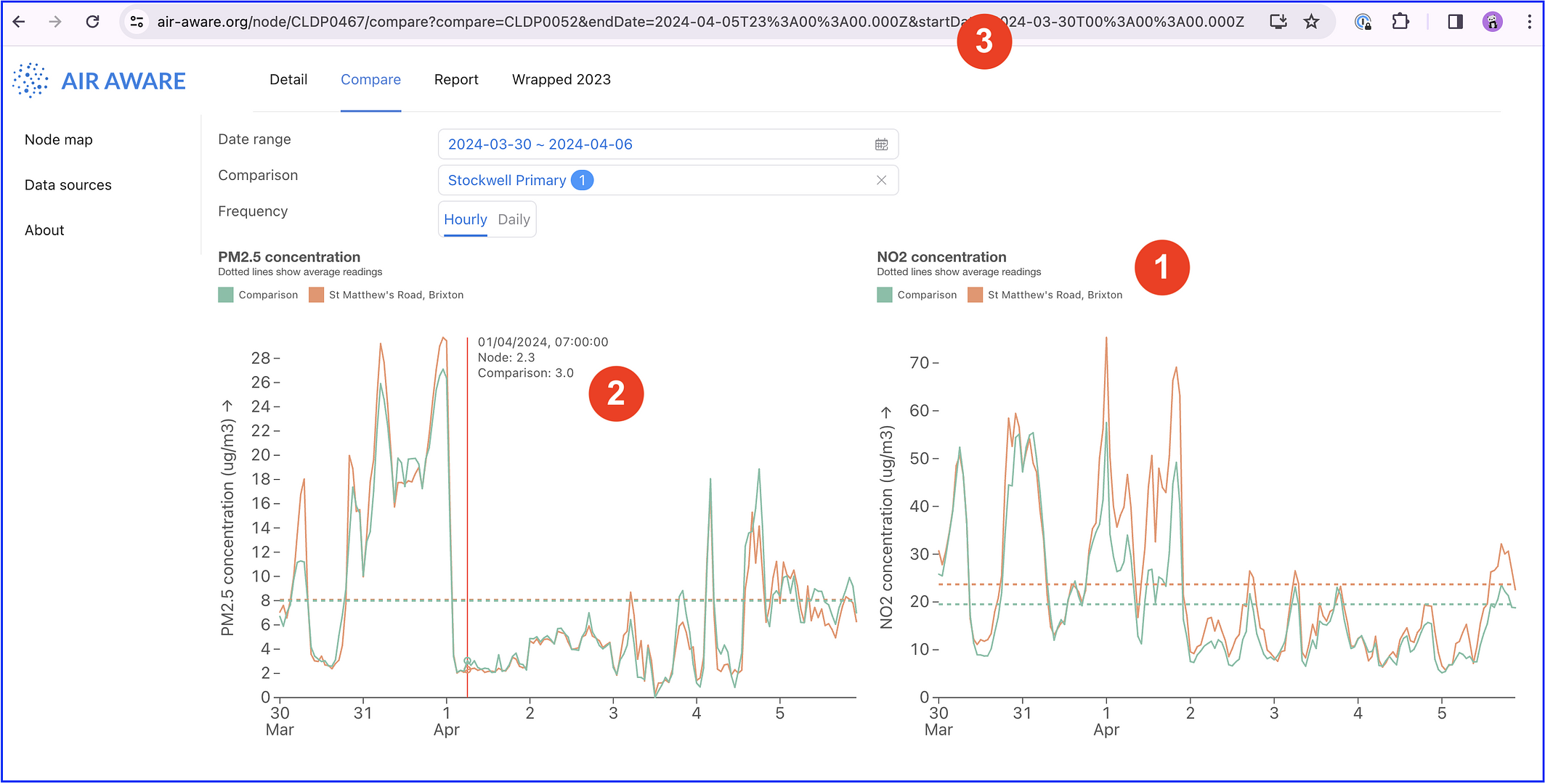
- Rather than saying “Node”, the chart now has the actual name of the node. Makes it a bit clearer if you cut and paste the chart into another document.
- The text on the tooltip (when you have the cursor over the chart) is a bit smaller, so it doesn’t get cut off as much
- When you change dates and comparison nodes, this gets added to the URL, meaning that you can copy-and-paste the URL and send it to someone and they will see the same date range and comparison nodes - eg, like this
